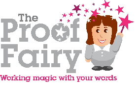
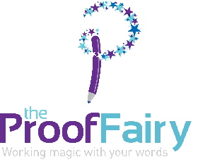
OK, so my proofreading/editing business, The Proof Fairy, started by accident and was really a bit of a jokey sideline for a long time – but since November 2009 it’s become my full time business, so I decided it was time to treat it as such and come up with a whole new brand identity for it. The fabulous Gareth Coxon of Dot Design has done me some logo designs and I know have to decide which one is going to work best for the business. There are two I really like – but it’s not me that counts, it’s my clients and prospective customers! So I thought I’d ask you for your opinion – remember, this is going to be used for a business that offers proofreading. editing and copywriting to small businesses mainly but also to authors, students etc ….
[poll id=”2“]


Comments also welcome – these aren’t the finished designs as some tweaking with surely go on!
Special thanks to Gareth at Dot Design!


Logo 2 has more magic!!
I feel the one on the right is more in keeping with what you do, professional with sparkle.
Having seen one earlier Alison, I have to say I prefer number 2. Possibly because grey is my least favourite colour!
Good luck with it
Joy
Fab logo’s Alison! I agree with Adam that number 2 maintains a very professional image, but with sparkle – love it! Good luck 🙂
Alison:
Prefer the font used in Logo #2 … looks more contemporary, but the strapline text is almost invisible – needs more contrast.
David
No2. I think it looks more professional. Might be a possibility that No1 might put off some fellas? But I think No2 illustrates your business more clearly and is not ambiguous.
Seriously??!
Btw, you’re missing a button for the voting. It should say “None of the above. Try again”.
Don’t like either of them. Not up to a professional standard. You should have a look at a good reference source book like Logo by Michael Evamy. Available from amazon.
Really like logo 2. I feel the strapline could be darker though as it is currently too light to read without squinting or pulling odd facial features.
No.2 easily.
No. 2 by a long shot. This voting mallarky is great!
The one on the right.
I find the company name combined with the one on the left a bit unprofessional. If I was going to pay someone to make sure my written documents sounded professional, I want to hire a professional. Amateur I can do on my own.
Definately the one on the right!!!
Actually, Alison, I really liked your magic wand and the strong black and white theme! I prefer the one on the right, but I don’t think it’s an improvement on your current logo… Sorry! Kx
Thanks for all the comments! Really been very useful to run this experiment – I was all set to go with the “wee me” logo until I realised just how much other people took against it! (see my blog at http://theprooffairy.wordpress.com/2010/05/21/putting-the-customer-first/ for the story!)
I do like the current black and white wand image BUT it is just an image from istock – anyone can use it and I’ve probably used it more than I should have done anyway, hence wanting to have my own identity. I love the pen and stars image so am very happy to work with that one to create my own identity!
Logo 2 is the choice for me.. 🙂